QGIS Natural History Collection Data Lesson
Exploration: Aggregating by regions
Overview
Teaching: 20 min
Exercises: 20 minQuestions
How can observations be aggregated by a given spatial unit of analysis?
Objectives
Join, aggregate, or summarize records by county.
Summarize observations intersecting counties.
To get started, open the processing toolbox. You will use the search feature to find the tools we’re running in this section of the tutorial. This tutorial only uses native QGIS algorithms but other analysis packages, such as GRASS and SAGA, offer additional tools you can install and explore (which require dependencies). Many of these algorithms can take up to several minutes to run on this dataset.
We are emphasizing exploration by date; place; and taxon
Assessing the subset
Now that we have created a subset of the occurrences within Santa Barbara County, these data have the EPA Ecoregions appended to the attribute table. Open the attribute table for SB_Eco_join. Scrolling to the far right, you will see that each point now has bioregion attributes. Take some time to explore the occurrences and query by ecoregion. Do the types of occurrences make sense for the given biomes?
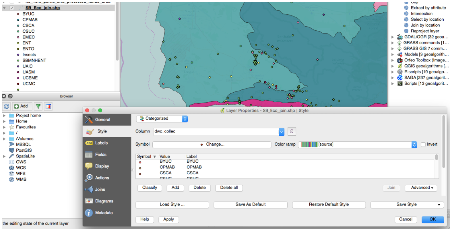
Symbolize by collection, collector, class
In the Properties of SB_Eco_join, we can change the symbology to reflect the distribution of occurrences by collection. In Style, change from Single Symbol to Categorized. The column to visualize is dwc_collec or dcterms_1 for collection and dwc_iden_6 for collector or dwc_class for Class. Do you notice any clusters by collection? By collector? By class? By any other attribute?
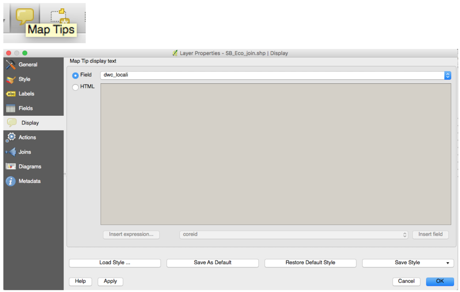
Popups for localities
In the Properties for SB_Eco_join, go to Display and select dwc_locali as the Field for Map Tips. This will enable you to preview the locality description of occurrences. You can choose another attribute to preview in this way as well. Also, click the Map Tips button to enable the Map Tips. Check the locality descriptions against the Gazetteer, the OSM Basemap, the Ecoregions; does it make sense?
Aggregation
How many observations occurred in each county? Do any counties have a disproportionate amount?
- Goal: find biases in collection as a first pass
- Tool: Count Points In a Polygon, (Join By Location, Select/Extract by Attribute/Location)
- Output: Shapefile with attribute table
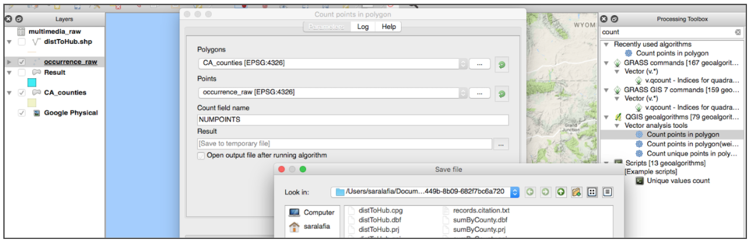
To open the toolbox panel, go to Processing > Toolbox. Search for the count points in a polygon tool. This tool summarizes the number of points that intersect each polygon in the feature of interest and writes a new shapefile of counties that contains the sum of points as an attribute in the attribute table. Below, that field is “Numpoints.”
Open attribute table and navigate to the “Numpoints” field. Sort by value by clicking on the header name to find the counties with the greatest and fewest number of observations.
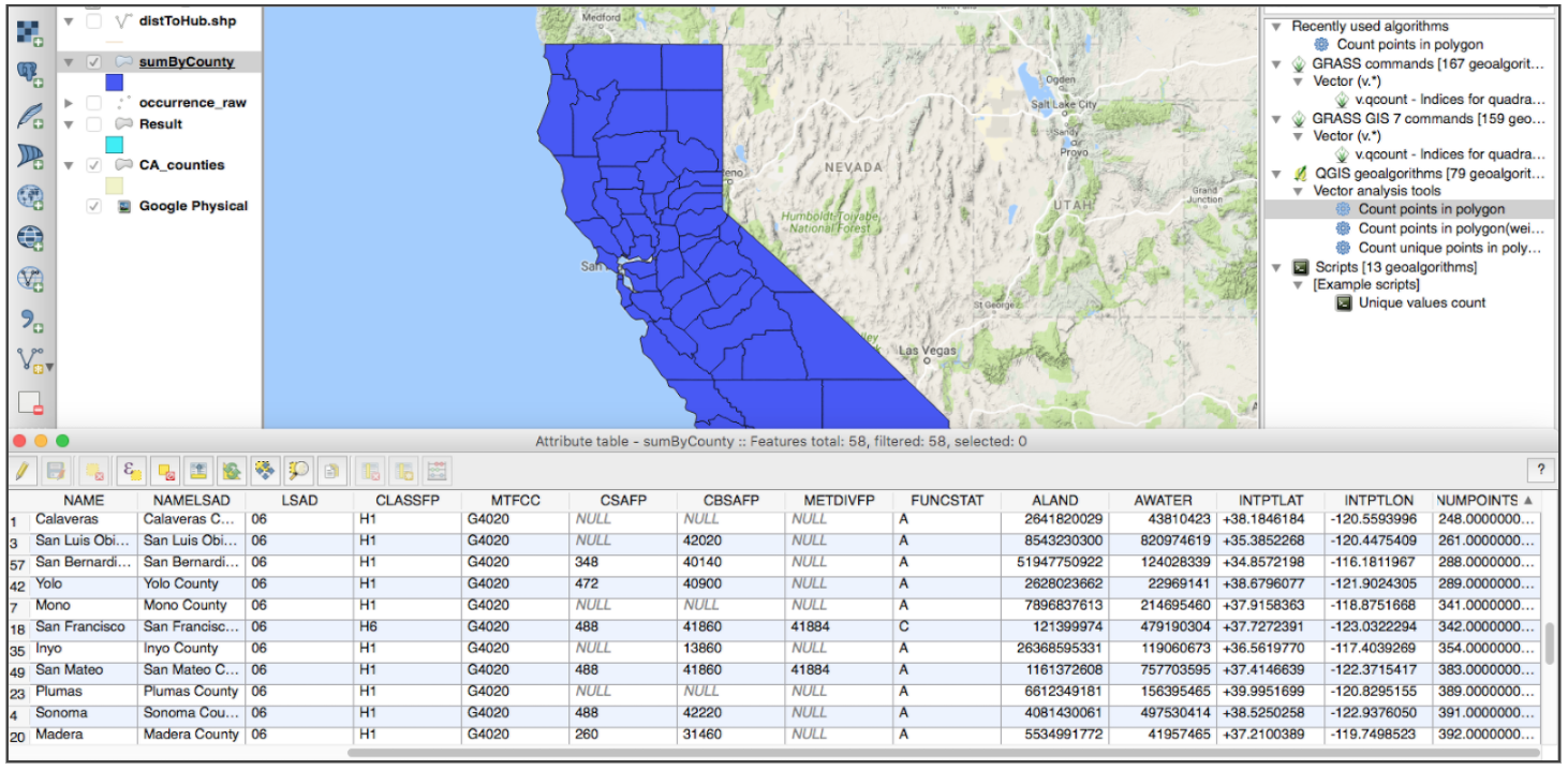
Move layer beneath the points to visualize which points correspond to which county. Changing the order of the layers in the left panel orders the way they are drawn on the canvas. You toggle them on and off by checking or unchecking the layers as well.
Symbology
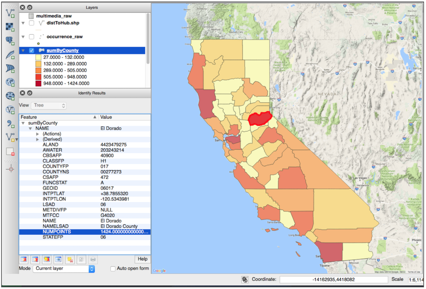
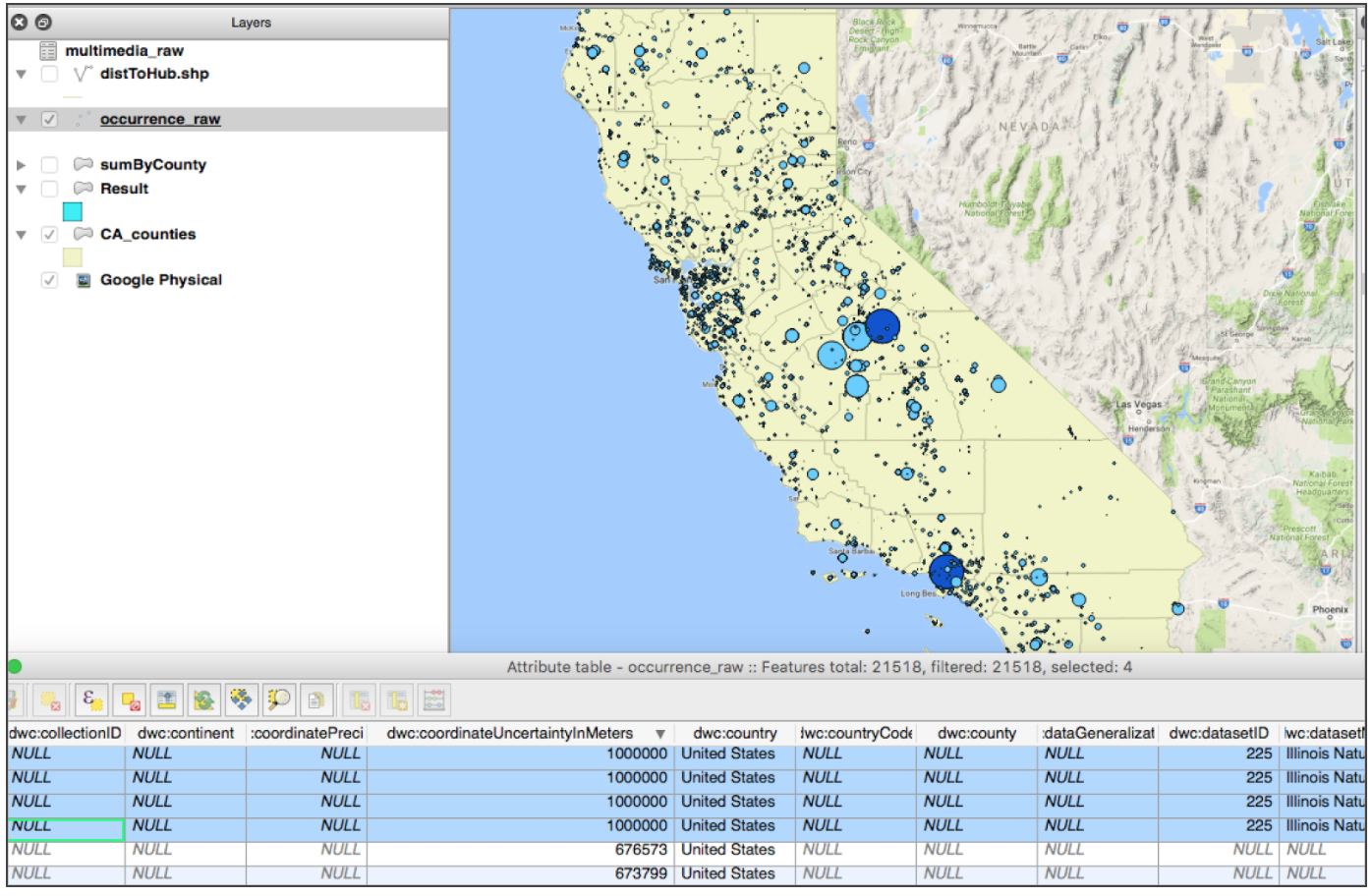
Which counties have the greatest number of observations? Which points have the greatest coordinate uncertainty in meters?
- Goal: visualize systematic biases or errors
- Tool: Style (Single Symbol, Categorized, Graduated, Proportional Circles)
- Output: same layer with updated properties
Now that the counties contain information for aggregated point counts, we can change the layer symbology to reflect the information. Right click on “occurrence_raw.csv” to select “Properties”.
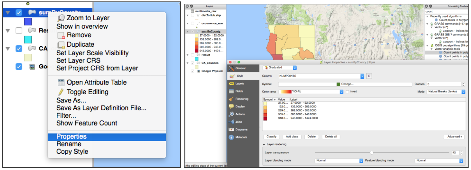
In the style tab, change from Single Symbol to Graduated. This allows you to pick a number of classes to style your data. Experiment with different numbers of breaks (7+/- 2 for legibility), color ramps (continuous), and distribution modes (natural breaks - jenks). This allows you to easily visualize which counties have the greatest and fewest observation points. We can use this in combination with the Identify tool to explore the number of observations in each county.
Next, try changing the symbology of the occurrences_raw.csv points to find which have the highest coordinate uncertainty to create a proportional symbol map that scales the radius of the point based on the uncertainty. The symbology options may vary between QGIS versions. This will highlight points with low positional precision.
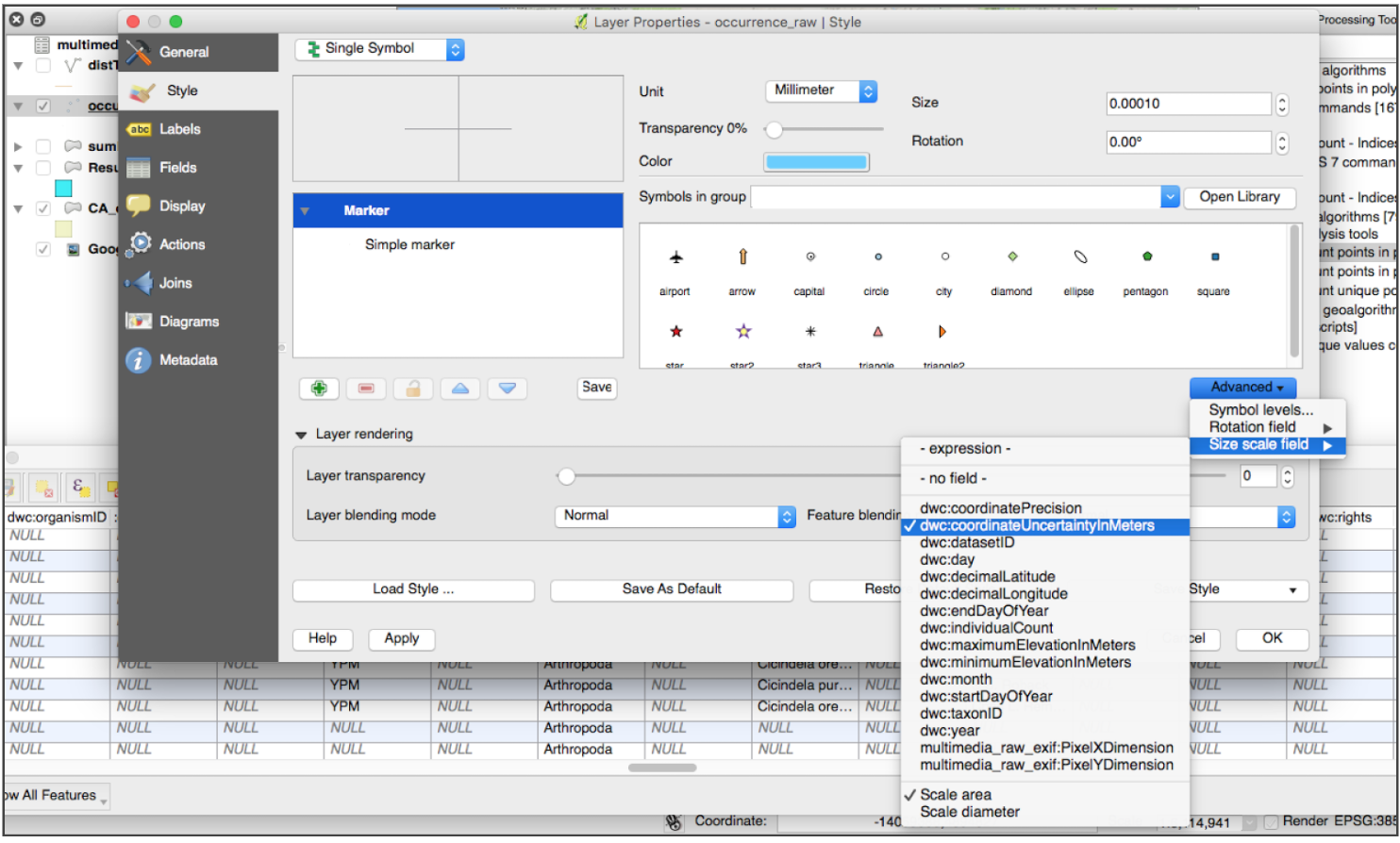
Select features of interest in the attribute table and highlight them on the map. You can for instance filter your data by removing records below a given threshold of precision. You can also use the Identify tool to click on specific points and see their attributes displayed in the left panel.
Intersection, Subsetting
Which observations occurred in Santa Barbara County? Around particular state or federal parks?
- Goal: subset data
- Tool: Extract By Attribute, Intersection, Select By Location - make a selection, save out, table edit
- Output: same layer with updated properties
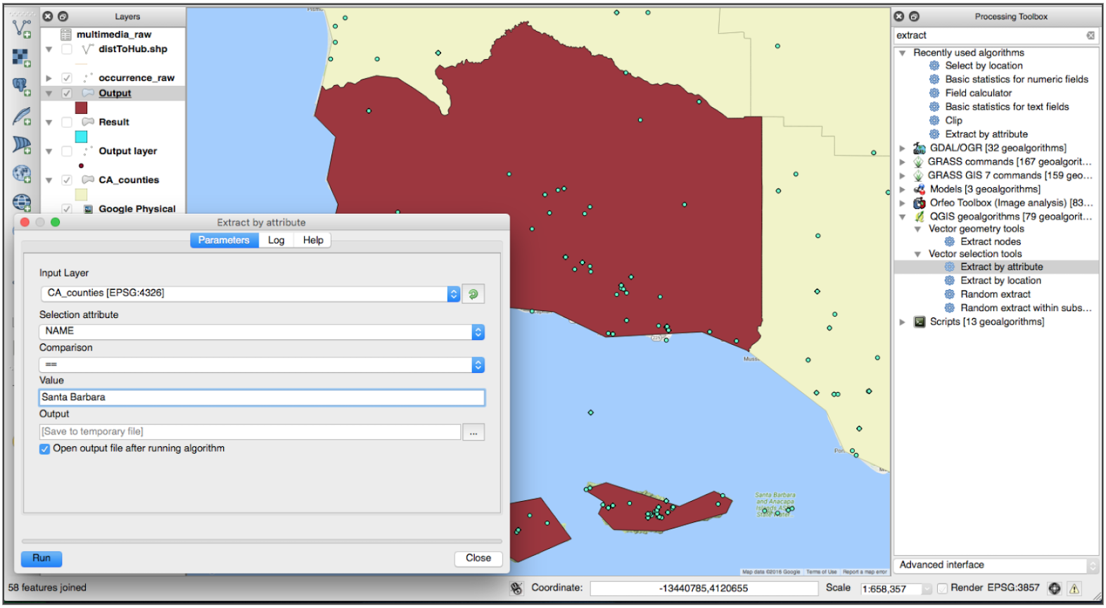
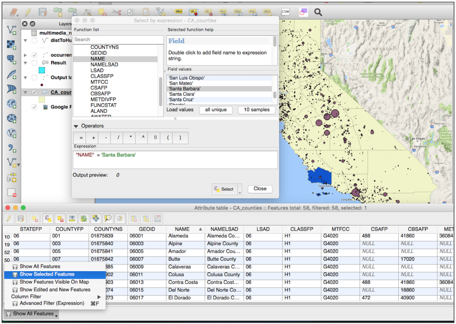
As we found in the previous step of aggregation, there are 662 observations in Santa Barbara County. Create a subset of data of just the points that occur in Santa Barbara County on which we can perform additional analysis. Find the Extract by attribute tool in the Processing toolbox. You will extract Santa Barbara County from the set of counties in CA counties. Save the new output selection as a layer named “Santa Barbara County” that you can use to clip and subset occurrence_raw points.
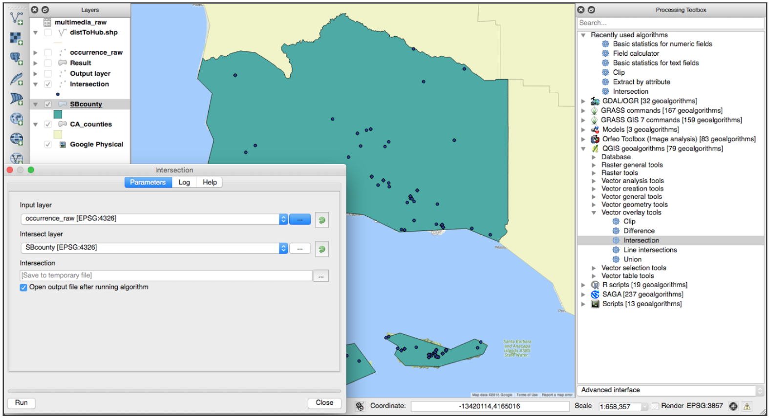
Next, open the Intersection tool. Select the “occurrences_raw” as the input layer and “Santa Barbara County” as the intersect layer. This will write the intersection of the layers to a new file.
We also select Santa Barbara County by building a query from the attribute table.
Key Points