

Spatio-Temporal Data Hackathon
Group 5 - Visualization
Ben Best, Matt Kwit, Meg Williams
2015-11-09
Group 5 - Visualization: Making Pretty Maps and Plots
Notes in Google Docs: Module Five - Making Pretty Maps & Plots - Google Docs
HTML rendered of this Rmd: bbest.github.io/NEON-DC-DataLesson-Hackathon/code/group05_visualization.html.
Learning Objectives
After completing this activity, you will know:
- Visual Outputs, generic to time series or maps
- Outputting to different formats: pdf, png w/ resolution. html/pdf.
- post-process in Adobe Illustrator or Inkscape
- Titles, axes labels. margins.
- Legends
- Tiling / Faceting.
- Color ramps. Choosing color ramps for types of data: categorical, continuous. - divergent. colorblind. Best practice for this data. Link out to more.
- Production Quality Maps, ie Cartography
- Scalebar, projection, N arrow. map-specific
- Symbology. pts, lines.
- Interactive
- web-based interactive plot using Javascript libraries
- specifics for R today, htmlwidgets R packages: leaflet, dygraphs
- Animation
- existing raster time series animation of chm tower air shed
- add time series next to it. point / pixel of individual stations + average. min/max/avg:
How to import rasters into R using the raster library. How to perform raster calculations in R.
Setup
suppressPackageStartupMessages({
library(raster) # work with rasters
library(dplyr) # work with data frames
library(rgdal) # read/write spatial files, gdal = geospatial data abstraction library
library(zoo) # timeseries core package
library(xts) # extended time series
library(ggplot2) # plotting
library(readr) # readr::read_csv() preferable to read.csv()
library(knitr) # knitting Rmarkdown to html
library(animation) # create animation ot the NDVI outputs
library(scales) # breaks and formatting for ggplot2
library(lubridate) # work with time
library(leaflet) # interactive maps htmlwidget
library(RColorBrewer) # color ramps
library(dygraphs) # interactive time-series htmlwidget
library(stringr) # handle strings
library(animation) # for making .gif animation
})
# set data directory (dd) and data URL (du)
dd = '../1_WorkshopData'
du = 'http://files.figshare.com/2365633/1_WorkshopData.zip'
wd = getwd()
if (!file.exists(dd)){
stop(
'Data directory not found:\n ', dd, '\n ',
'You need to download and unzip the following into the root of this repository:\n ', du)
}Quick Plot: Raster
# read raster
chm <- raster(file.path(dd, "NEON_RemoteSensing/HARV/CHM/HARV_chmCrop.tif"))
# see metadata
chm## class : RasterLayer
## dimensions : 1367, 1697, 2319799 (nrow, ncol, ncell)
## resolution : 1, 1 (x, y)
## extent : 731453, 733150, 4712471, 4713838 (xmin, xmax, ymin, ymax)
## coord. ref. : +proj=utm +zone=18 +datum=WGS84 +units=m +no_defs +ellps=WGS84 +towgs84=0,0,0
## data source : /Users/bbest/github/NEON-R-Make-Pretty-Maps-Plots/1_WorkshopData/NEON_RemoteSensing/HARV/CHM/HARV_chmCrop.tif
## names : HARV_chmCrop
## values : 0, 1098.62 (min, max)# quick plot
plot(chm, main="NEON Canopy Height Model (Tree Height)\nHarvard Forest")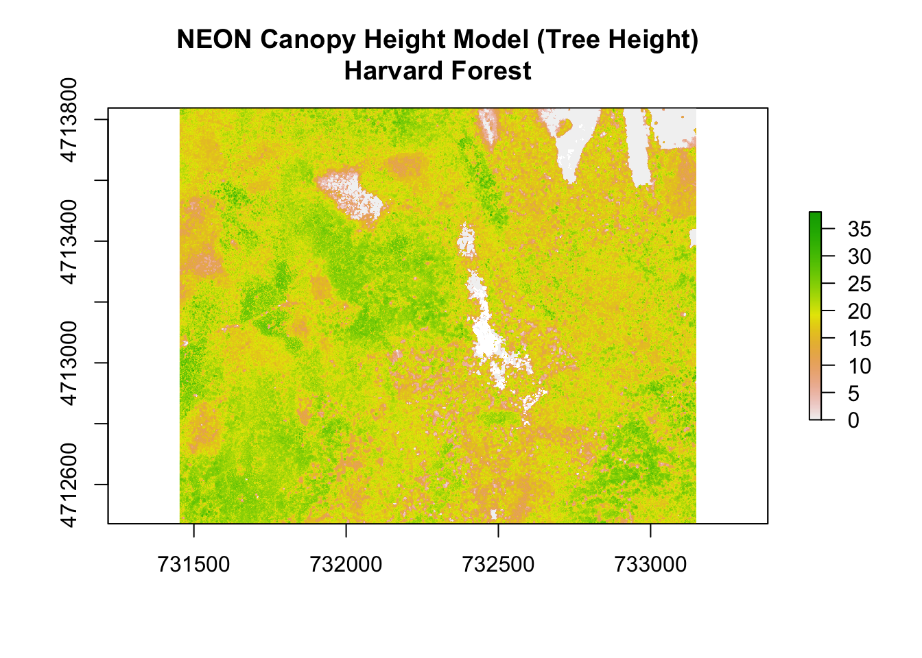
Sequencing through Cartographic Elements
Locator Map
- add polygon from package(map)
add point Harvard forest coords
- change CRS of maps package data
- focus/ zoom into site level
- symbology: change char, size, color, fill
margins, axes, titles
introduce color palette with RColorBrewer()
Study site
- add line files
- change symbology
- add NDVI raster extent
- change symbology
Production Quality Plot
Raster
#customize legend, add units (m), remove x and y labelsTime-Series
Matt’s using base plot
Leah’s original using ggplot
harMet = read.csv(file.path(dd, 'AtmosData/HARV/hf001-10-15min-m.csv'))
#clean up dates
#remove the "T"
#harMet$datetime <- fixDate(harMet$datetime,"America/New_York")
# Replace T and Z with a space
harMet$datetime <- gsub("T|Z", " ", harMet$datetime)
#set the field to be a date field
harMet$datetime <- as.POSIXct(harMet$datetime,format = "%Y-%m-%d %H:%M",
tz = "GMT")
#list of time zones
#https://en.wikipedia.org/wiki/List_of_tz_database_time_zones
#convert to local time for pretty plotting
attributes(harMet$datetime)$tzone <- "America/New_York"
#subset out some of the data - 2010-2013
yr.09.11 <- subset(harMet, datetime >= as.POSIXct('2009-01-01 00:00') & datetime <=
as.POSIXct('2011-01-01 00:00'))
#as.Date("2006-02-01 00:00:00")
#plot Some Air Temperature Data
myPlot <- ggplot(yr.09.11,aes(datetime, airt)) +
geom_point() +
ggtitle("15 min Avg Air Temperature\nHarvard Forest") +
theme(plot.title = element_text(lineheight=.8, face="bold",size = 20)) +
theme(text = element_text(size=20)) +
xlab("Time") + ylab("Mean Air Temperature")
#format x axis with dates
myPlot + scale_x_datetime(labels = date_format("%m/%d/%y"))## Warning: Removed 2 rows containing missing values (geom_point).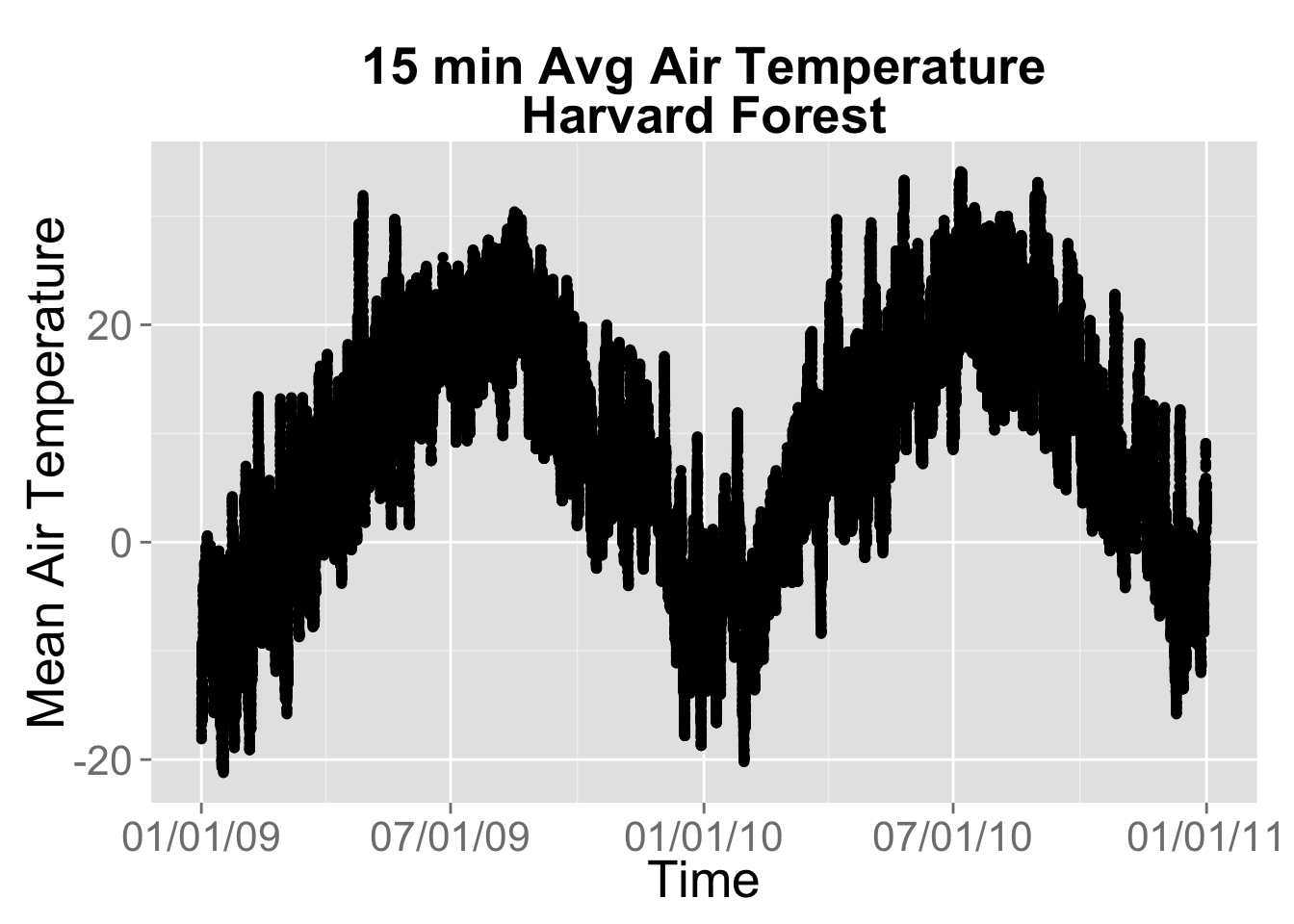
Animation
Plot the time series.
- build raster stack
- get day of year for each layer of raster stack
##Path to rasters
rastPath <- file.path(dd, 'Landsat_NDVI/HARV/2011/ndvi')
##Get names of raster files and extract Day of Year
##The title of each raster starts will a three digit number that indicates the day of year.
##We can manualy input it or we can use str_extract pull the information using regular expressions.
rastFiles <- list.files(rastPath, full.names=FALSE, pattern = ".tif$")
doy <- c(5, 37, 85, 133, 181, 197, 213, 229, 245, 261, 277, 293, 309)
doy <- as.numeric(str_extract(rastFiles,"^[0-9]{3,3}"))
##List full raster paths and read raster stack
rastFiles <- list.files(rastPath, full.names=TRUE, pattern = ".tif$")
rastStack <- stack(rastFiles)
## Read in RGB files
rgbPath <- file.path(dd, 'Landsat_NDVI/HARV/2011/RGB')
rgbFiles <- list.files(rgbPath, full.names=TRUE, pattern = ".tif$")
#Get climate(Temperature) Data
csvPath = file.path(dd, 'AtmosData/HARV')
csvFiles <- list.files(csvPath, full.names=TRUE, pattern = "daily")
dayAtm = read.csv(csvFiles)
## Ploting Time series data with emphasis on the year we have NDVI data for, 2011.
## Initial plot call defines the plotting region based on all of the data within the plot.
## In this plot we are not going plot the data, type = 'n', label the plot, or add axes.
plot(x = dayAtm[,'jd'],y = dayAtm[,'airt'],type='n',xlab="",ylab="",bty="n",xaxt='n',yaxt='n')
# Add a grid to the background
grid()
# Add all of the data points to the plot.
# col = color of the points, rgb(red,green,blue,transparency),pch = point type, cex = point size
points(x = dayAtm[,'jd'],y = dayAtm[,'airt'],col=rgb(.2,.2,.2,.1),pch=20,cex=.75)
# whr = which rows of the data are from 2011
yr = format(as.Date(dayAtm[,'date']),"%Y")
whr = which(yr =='2011')
# store a rolling mean for 2011 to smooth the data
#meanTemp <- rollmean(dayAtm[whr,'airt'],30)
meanTemp <- c(
rollmean(dayAtm[whr,'airt'],30, align='left')[1:14],
rollmean(dayAtm[whr,'airt'],30, align='center'),
rollmean(dayAtm[whr,'airt'],30, align='right')[(365-15-30+2):(365-30+1)])
# store the days for 2011
days <- dayAtm[whr,'jd']
# Add 2011 data as a line. lwd = line width
lines(x = days,y = meanTemp, col='black',lwd=2)
# Add axes to plot. Side = which side of the plot to place the axis, 1=bottom,2=left,3=top,4=right
axis(side = 1,tick = F)
axis(side = 2,tick = F)
# Add labels
title(xlab="Day of Year",ylab="Temperature (C)",main = "30 Day Mean Temperature" )
#Highlight data at one day of year.
whr = which(days == 197) #Which row of dataset is DOY 197
#Add vertical(v=) and horizontal(h=) lines at DOY 197
abline(v = as.numeric(197),h = meanTemp[whr],col='red',lty=3)
#Add point at DOY 197
points(as.numeric(197),meanTemp[whr],col='red',pch=20)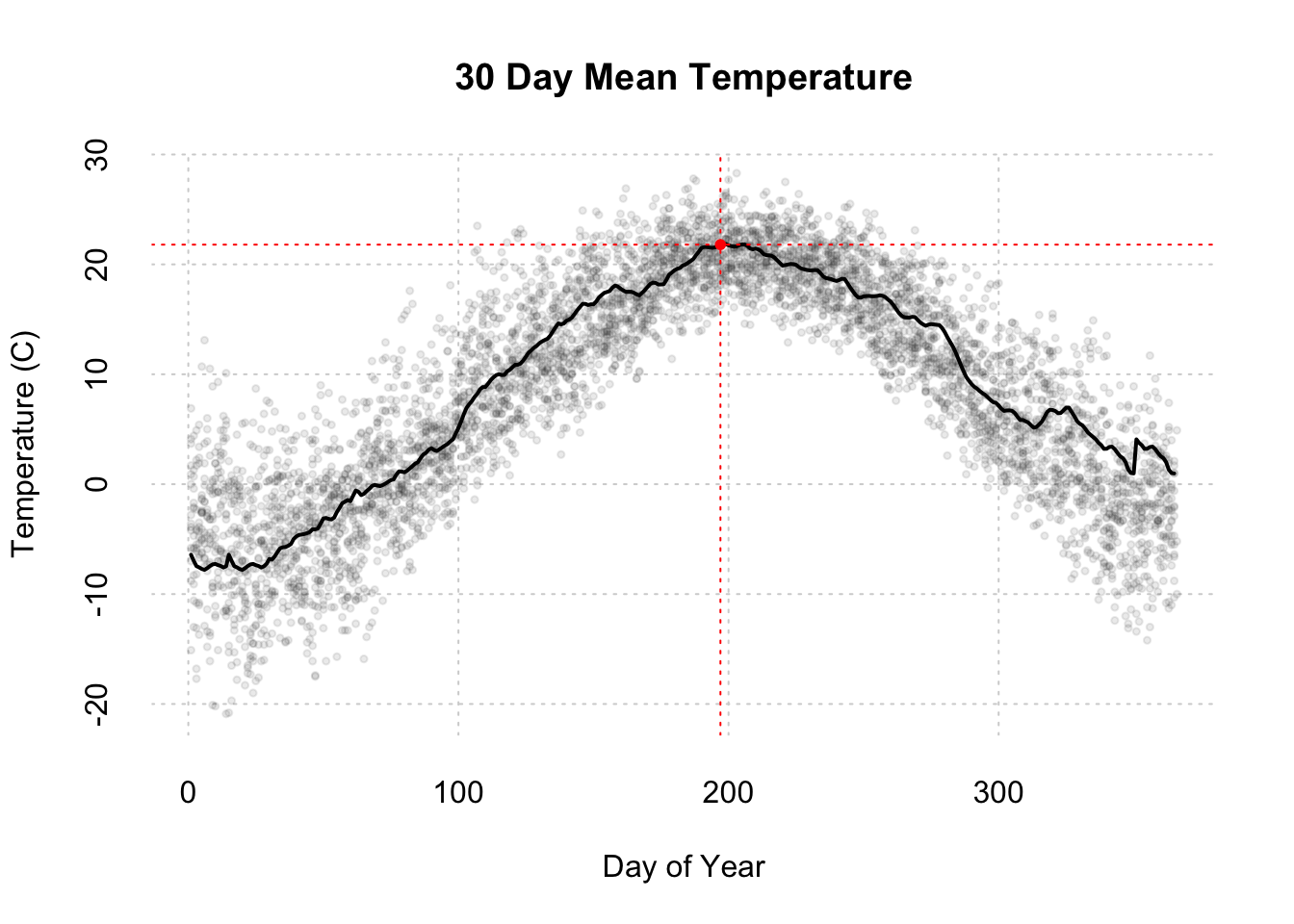
And here’s how we would take the above plot and wrap it into a function for future use with the animated GIF.
TODO: Explain function and rationale for later.
# Put all of these lines into one function call
timeSeriesPlot <- function(x = dayAtm[,'jd'], y = dayAtm[,'airt'],
emphYear = '2011', emphDOY = '197',
xlab="Day of Year",ylab="Temperature (C)",main = "30 Day Mean Temperature"
){
plot(x = x,y = y,type='n',xlab="",ylab="",bty="n",xaxt='n',yaxt='n')
# Add a grid to the background
grid()
# Add all of the data points to the plot.
# col = color of the points, rgb(red,green,blue,transparency),pch = point type, cex = point size
points(x = x,y = y,col=rgb(.2,.2,.2,.1),pch=20,cex=.75)
# whr = which rows of the data are from 2011
yr = format(as.Date(dayAtm[,'date']),"%Y") #make year from date
whr = which(yr ==emphYear)
# store a rolling mean for 2011 to smooth the data
#meanTemp <- rollmean(dayAtm[whr,'airt'],30)
meanTemp <- c(
rollmean(dayAtm[whr,'airt'],30, align='left')[1:14],
rollmean(dayAtm[whr,'airt'],30, align='center'),
rollmean(dayAtm[whr,'airt'],30, align='right')[(365-15-30+2):(365-30+1)])
# store the days for 2011
days <- x[whr]
# Add 2011 data as a line. lwd = line width
lines(x = days,y = meanTemp, col='black',lwd=2)
# Add axes to plot. Side = which side of the plot to place the axis, 1=bottom,2=left,3=top,4=right
axis(side = 1,tick = F)
axis(side = 2,tick = F)
# Add labels
title(xlab=xlab,ylab=ylab,main = main ,cex.lab=1.25)
#Highlight data at one day of year.
whr = which(days == emphDOY) #Which row of dataset is emphasis
#Add vertical(v=) and horizontal(h=) lines at emphasis
abline(v = as.numeric(emphDOY),h = meanTemp[whr],col='red',lty=3)
#Add point at DOY emphasis
points(as.numeric(emphDOY),meanTemp[whr],col='red',pch=20)
}It’s time for the animator! (not the terminator).
To animate a gif we will need to use the animation library and loops sequentially to display the graphics to be displayed
The structure of a for loop
TODO: Add a quick intro
Here’s how to animate three plotting functions for a single animated gif.
# without a function
saveGIF(
# add every thing to plot in the gif (this would be a great place to introduce functions ass well)
for (i in 1:length(rastFiles)) {
# par: controls the graphics element, mfrow=c(# of rows, # of columns), mar=c(botom margin size,left,right,top,right)
par(mfrow=c(1,3),mar=c(4,5,4,5))
# add our NDVI raster from above (great if this is a function),
#rastStack[[i]], iterates through the raster stack for each layer in the gif
plot(rastStack[[i]],legend=T,
main=paste0("NDVI on Day of Year ", doy[i]),
col=rev(terrain.colors(30)),
zlim=c(1500,10000) ,bty='n',
cex.lab=2,cex.axis=1.5,cex.main=2.5,
legend.width=2, legend.shrink=0.75)
# add the timeseries we created previously created he only differnaces is where points are emphasized
plot(dayAtm[,'jd'],dayAtm[,'airt'],type='n',xlab="",ylab="",bty="n",xaxt='n',yaxt='n')
grid()
points(dayAtm[,'jd'],dayAtm[,'airt'],col=rgb(.2,.2,.2,.1),pch=20,cex=.75)
whr = which(yr =='2011')
meanTemp <- rollmean(dayAtm[whr,'airt'],30)
days <- dayAtm[whr,'jd']
lines(days,meanTemp,col='black',lwd=2)
axis(1,tick=F,cex.axis=1.5)
axis(2,tick=F,cex.axis=1.5)
title(xlab="Day of Year",ylab="",main = "30 Day Mean Temperature (C)"
,cex.lab=2,cex.main=2.5)
## Emphasis moves by iterator: doy[i]
whr = which(days == as.numeric(doy[i]))
abline(v = as.numeric(doy[i]),h = meanTemp[whr],col='red',lty=3,lwd=2)
points(as.numeric(doy[i]),meanTemp[whr],col='red',pch=20,cex=2)
## Add RGB images to plot
rgbStack <- stack(rgbFiles[i])
plotRGB(rgbStack)
},
movie.name = "temp.gif",
ani.width = 1500, ani.height = 500,
interval=1)Better yet, let’s create functions to do the work so we can have more readable code with less repetition.
path_gif = sprintf('./%sanimation.gif', knitr::opts_chunk$get('fig.path'))
# this uses a function
saveGIF(
for (i in 1:length(rastFiles)) {
par(mfrow=c(1,3),mar=c(4,5,4,5))
plot(rastStack[[i]],
main=paste0("NDVI on Day of Year ", doy[i]),
col=rev(terrain.colors(30)),
zlim=c(1500,10000) ,bty='n',
cex.lab=2,cex.axis=1.5,cex.main=2.5,
legend.width=2, legend.shrink=0.75)
timeSeriesPlot(emphDOY = doy[i])
rgbStack <- stack(rgbFiles[i])
plotRGB(rgbStack)
},
movie.name = 'temp.gif',
ani.width = 1500, ani.height = 500,
interval=1)## Executing:
## 'convert' -loop 0 -delay 100 Rplot1.png Rplot2.png Rplot3.png
## Rplot4.png Rplot5.png Rplot6.png Rplot7.png Rplot8.png
## Rplot9.png Rplot10.png Rplot11.png Rplot12.png Rplot13.png
## 'temp.gif'
## Output at: temp.gif## [1] TRUEres = file.copy('temp.gif', path_gif, overwrite=T)
res = file.remove('temp.gif')
Interactive Plots
Raster
# project if not already in mercator for leaflet
chm_mer = projectRasterForLeaflet(chm)
# get color palette
pal = colorNumeric(rev(brewer.pal(11, 'Spectral')), values(chm_mer), na.color = "transparent")
# output interactive plot
leaflet() %>%
addTiles() %>%
addProviderTiles("Stamen.TonerLite", options = providerTileOptions(noWrap = TRUE)) %>%
addRasterImage(chm_mer, colors=pal, project=F, opacity=0.8) %>%
addLegend(pal=pal, position='bottomright', values=values(chm_mer), title='CHM')Time-Series
# warning: resource intensive / time consuming to knit (~ 1 min)
# drop duplicate datetimes and assign rownames for later conversion to xts
ts = yr.09.11[!duplicated(as.character(yr.09.11$datetime)),]
row.names(ts) = as.character(ts$datetime)
date_window = row.names(ts)[c(
which.max(row.names(ts) >= '2010-01-01 00:00:00'),
which.min(row.names(ts) < '2011-01-01 00:00:00'))]
# plot
ts %>%
select(airt) %>%
as.xts() %>%
dygraph() %>%
dyRangeSelector(date_window)